How to Choose the Right Paint Colors for Small Spaces
Interior Painting
May 27, 2026
Small rooms don't have to feel cramped. Learn professional painting tricks to make compact Cape Cod spaces feel larger, brighter, and more inviting.
Living on Cape Cod often means charming but compact living spaces. Whether it's a cozy cottage bedroom, a small bathroom, or a tight hallway, the right paint color can transform a cramped space into one that feels open and airy.
The Myth of "Only White Works"
While white is a safe choice, it's not the only option for small spaces. The key is understanding how color, light, and perception interact.
What actually matters:
Light reflectance value (LRV) — Higher LRV colors reflect more light
Undertones — Cool undertones recede, making walls feel farther away
Finish — Satin and semi-gloss reflect more light than flat/matte
Best Colors for Small Rooms
Small Bedrooms
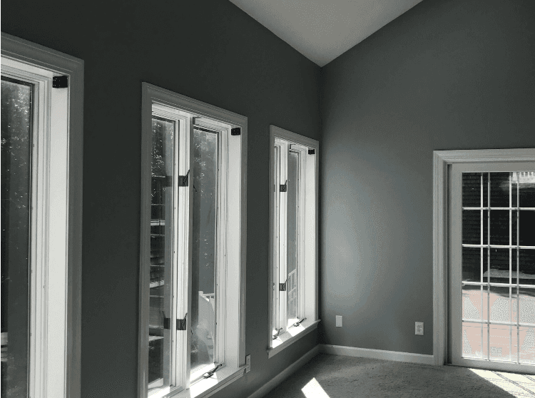
Soft blue-gray — creates depth without darkening
Pale sage — brings nature in without overwhelming
Warm white with pink undertones — flattering and expansive
Light lavender — calming and visually spacious
Small Bathrooms
Crisp white — timeless, especially with white fixtures
Soft aqua — spa-like and coastal
Pale gray — sophisticated and neutral
Light seafoam — fresh and Cape Cod appropriate
Small Kitchens
White with warm undertones — keeps it bright and clean
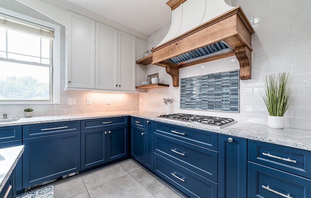
Light gray cabinets — modern and spacious
Soft yellow — cheerful without being overwhelming
Pale blue — coastal and calming
Professional Tricks to Make Spaces Feel Larger
Paint ceilings the same color as walls (or one shade lighter) — eliminates visual boundaries
Use vertical stripes — draws the eye up, making ceilings feel higher
Paint the far wall a darker shade — creates depth and makes the room feel longer
Match trim color to walls — reduces visual breaks that make spaces feel choppy
Use high-gloss on trim — reflects light and adds dimension
What to Avoid
Dark accent walls in small rooms — they make the room feel like it's closing in
High contrast color schemes — too many color breaks make spaces feel fragmented
Flat/matte finishes everywhere — they absorb light instead of reflecting it
Red and orange tones — they visually advance, making walls feel closer
Book your free estimate and let us help you choose colors that make every room feel its best.